Lettering and balloons
The letterer worked first, and the artist drew around the space that had been left.
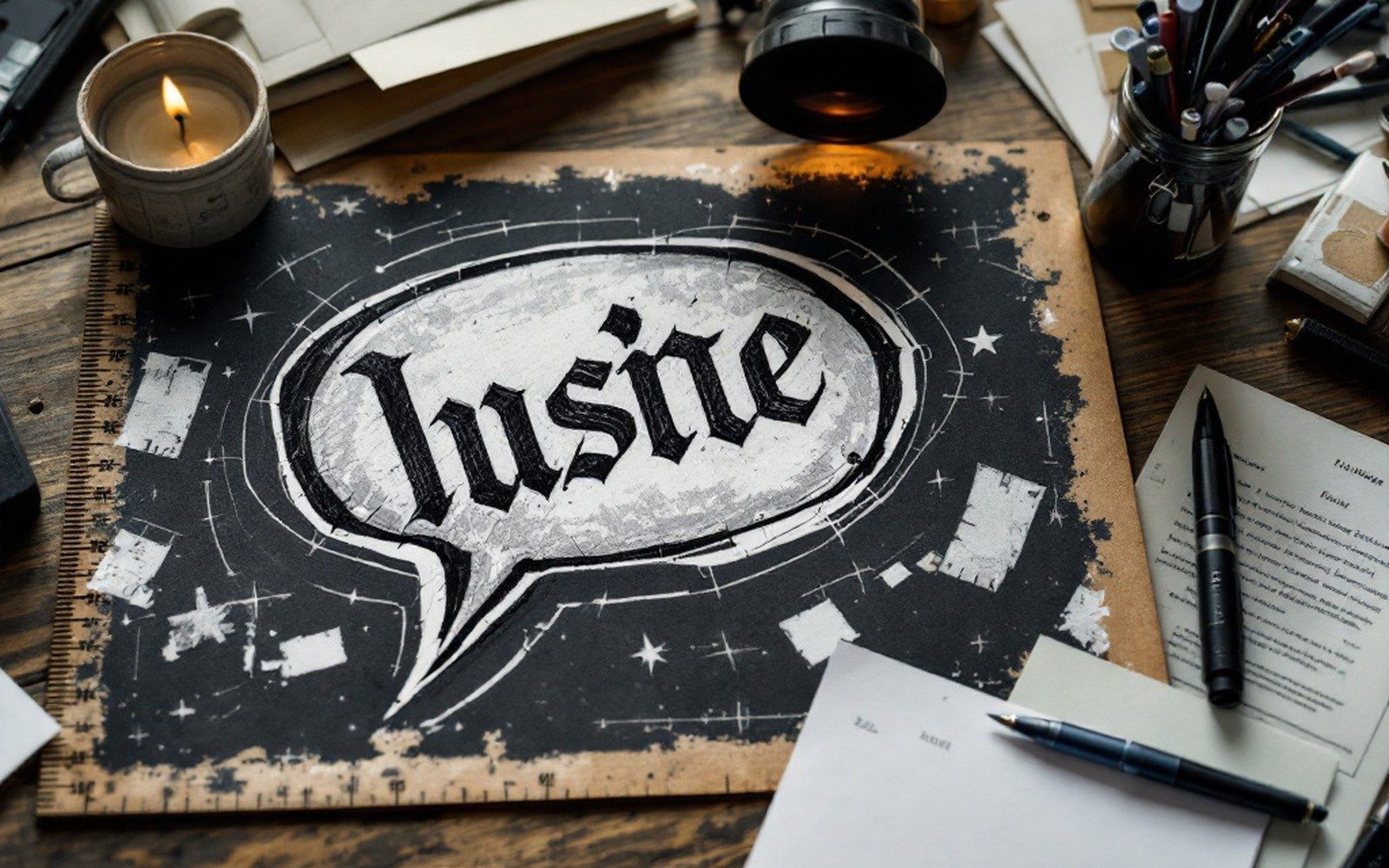
The balloon comes before the picture
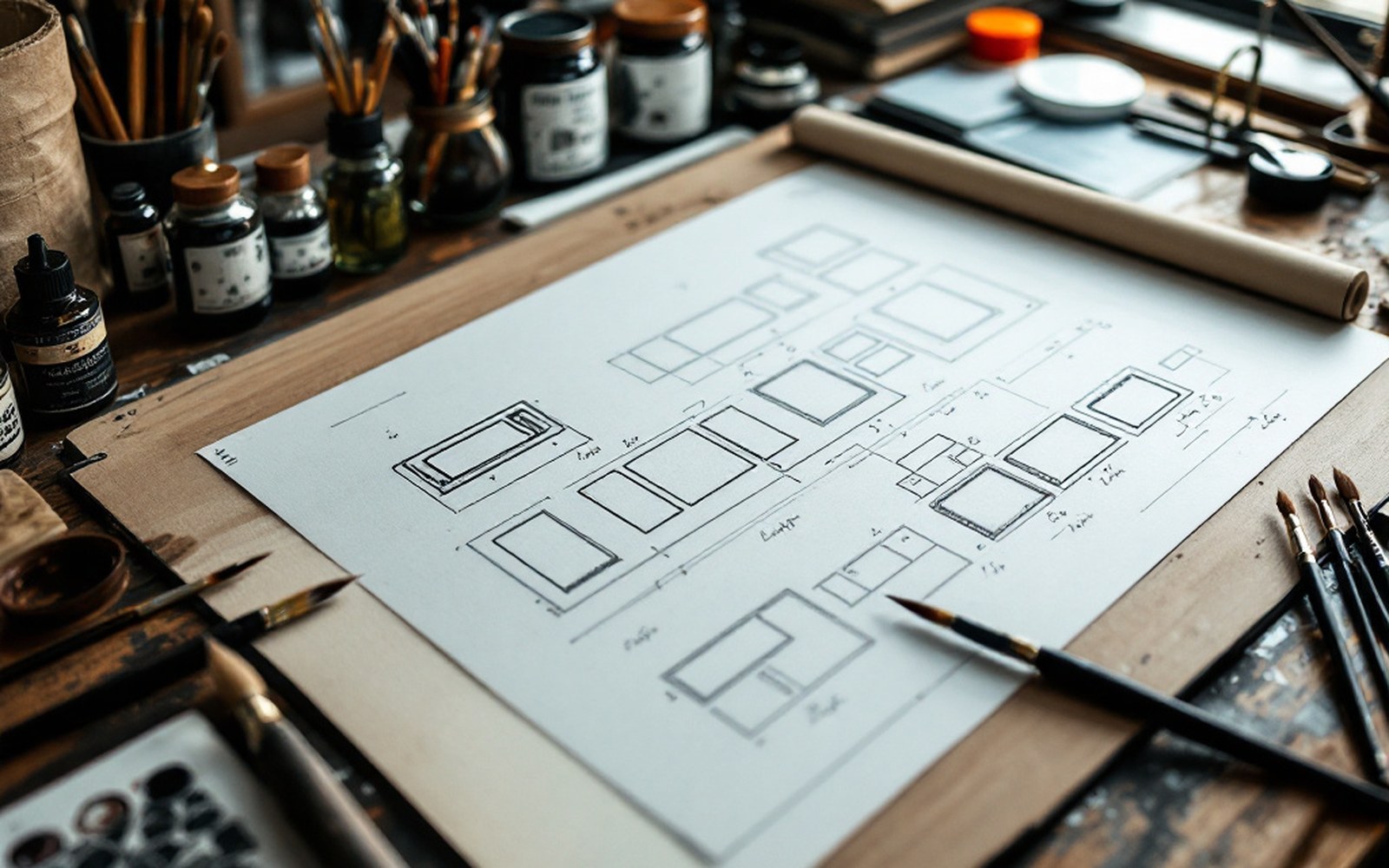
In the production workflow of the American comic book at its commercial peak, lettering was not the last step. It was among the first. A writer delivered a script — or, in the Marvel method, a rough plot for the artist to draw from — and, when a full script existed, a letterer could rule the balloon positions and hand-letter the dialogue directly onto the artboard before a penciller had finished the page. The reason is simple and structural: a balloon is a shape that occupies picture space, and if you draw the picture first, you have nowhere to put the words without covering something important. Lettering set the terms; the art negotiated with them.
The artboard itself was standardised to work at a reduction ratio. Original art was drawn roughly twice the printed size — the exact board dimensions varied by publisher, but DC and Marvel both settled on boards that reduced to the printed pamphlet formats by a known factor. Working large and reducing meant that small inconsistencies in line weight and lettering tightened up in print and looked more deliberate than they were.
On the record
How the page was built
- 01Original artboard drawn roughly twice the printed size for reduction
- 02Lettering was applied before finished pencilling, on the same board
- 03Ames lettering guides ruled in pencil, then erased after inking
- 04Balloon outlines drawn with ellipse templates and French curves
- 05Caps-only standard maintained for legibility on absorbent newsprint
Hand lettering as a craft with rules
Comic book lettering followed conventions that were not written down in any formal standard but were maintained through studio practice and imitation. Capital letters were the norm — easier to read at small sizes on newsprint, where ink spread into the paper fibres and soft curves could close up. Ames lettering guides, ruled in pencil and erased after inking, kept the cap height consistent from panel to panel. A skilled letterer maintained an even texture across the balloon: not too tight, not too loose, no rivers of white space running vertically through the copy.
The balloon itself is a visual argument about who is speaking and when. Its tail — the pointer — was drawn toward the speaker's mouth, but the balloon's position in the panel had to honour reading order: left to right, top to bottom, matching the sequence in which the eye moves across the page. A balloon placed too low in a panel, or overlapping a second speaker's balloon in the wrong sequence, created genuine confusion about which word came first. Getting this wrong was a drawing problem dressed as a typography problem.
Comic book lettering followed conventions that were not written down in any formal standard but were maintained through studio practice and imitation.
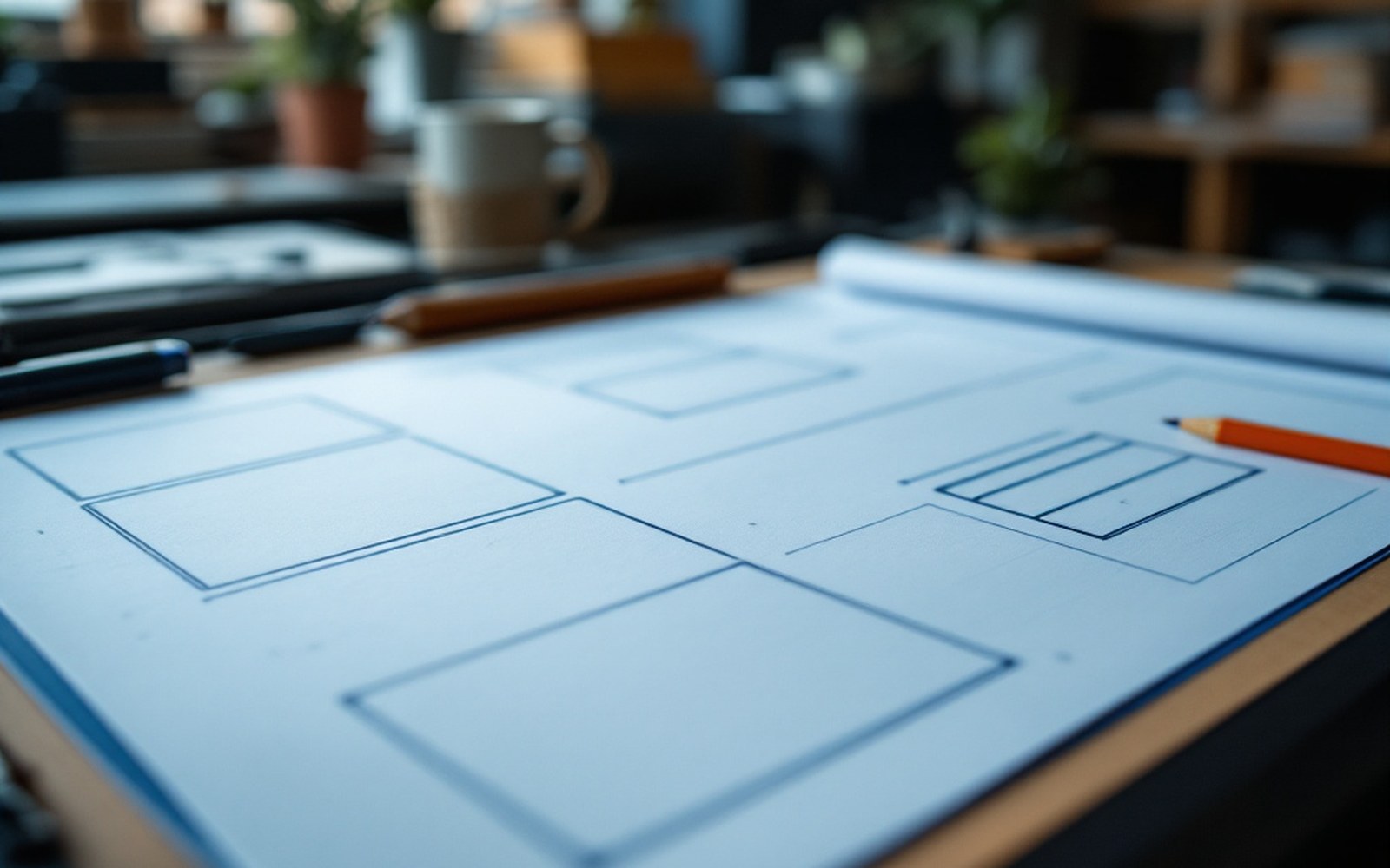
Sound effects were a different discipline entirely. Where dialogue required regularity, effects required invention — each one designed as a piece of lettering that carried its own visual weight, echoing the action it described. The letterforms bent, shattered, or burst outward, and a good effect was drawn from scratch rather than copied from a stock sheet.
Production constraints and what they fixed
Balloon outlines were almost always simple ovals or rounded rectangles, partly because they were drawn with ellipse templates and French curves for speed, and partly because a clean outline reproduced well on newsprint and letterpress equipment that could not reliably hold a fine or complicated stroke. The thought balloon — scalloped edges, no tail but a chain of smaller circles leading to the thinker — was a distinct visual convention that readers learned to decode without instruction. Whisper balloons used a dashed outline; radio or off-panel speakers were typically enclosed in a jagged or rectangular balloon with a different tail shape.
On the record
Balloon types
- 01Oval/rounded rectangle — standard speech
- 02Scalloped with bubble-chain — thought balloon
- 03Dashed outline — whisper or quiet speech
- 04Jagged or rectangular — radio, telephone, off-panel voice
The letterer's name rarely appeared anywhere in the finished book. For most of the Silver Age, lettering credits were not given at all. The craft was treated as mechanical production work even when it required constant visual judgment — how much to compress a line, where to break for sense rather than for space, when to shrink the type slightly rather than redraw the balloon and disrupt the penciller's composition.
What the letterer left behind was a set of shapes that the artist had to treat as fixed architecture. The dialogue was already there. The picture had to make room.