Separations
Colour was specified as percentages of four inks and cut by hand as separate films, one per plate.

Four inks, four films, four chances to get it wrong
Colour in a printed comic was never applied directly to the page. What the reader saw — the red cape, the flat yellow sky, the shadow pooled under a chin — was the optical result of four transparent inks laid one over another in rapid succession on a press running at speed. The inks were cyan, magenta, yellow and black: the same four used in commercial offset and letterpress printing generally, and chosen not because they were primary colours in any painterly sense but because together, in the right proportions, they could approximate most of the colours a human eye would accept as vivid. Each ink required its own printing plate, and each plate began as a piece of photographic film cut or painted by hand. That process was called colour separation.
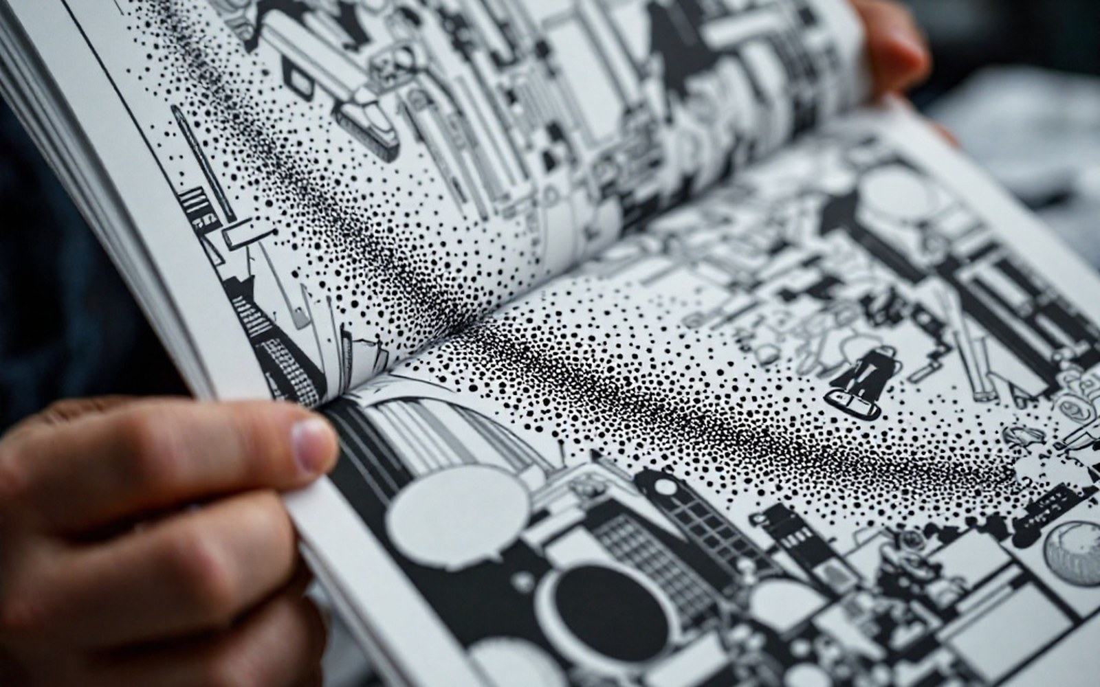
The logic is worth holding clearly in mind, because it governs every visual decision made at the production stage. If you want a flat red, you do not use red ink — there is no red ink in the process. You combine a percentage of magenta with a percentage of yellow and zero cyan, producing a result the eye reads as red. A deep green is a mix of cyan and yellow. A brownish shadow might be cyan at a low percentage, magenta at a slightly higher one, yellow at a further value and black on top. Every colour in a comic book resolves, when examined closely enough, into a pattern of dots from the four plates — the Ben-Day dot structure that defined the look of American newsprint comics for decades.

On the record
How it works — the process chain
- 01Flat colour specified as percentages of four inks: cyan, magenta, yellow, black (CMYK)
- 02Colourist painted a watercolour or gouache guide over a photographic print of the line art
- 03Separator cut rubylith or amberlith masking film into four overlays, one per ink channel
- 04Each overlay photographed to produce a film negative; each negative used to burn a printing plate
- 05All four plates run in sequence on the press; the overlapping transparent ink dots produce the visible colour
How the films were made
In standard commercial printing by the mid-twentieth century, separations for photographic originals were made by shooting the image through a series of colour filters and screens onto panchromatic film, producing four halftone negatives automatically. Comic book colour did not work that way, because comic book colour was not photographic. It was specified flat, in zones, by a colourist working from the inked line art.
The colourist worked on a photographic print of the original artwork, using watercolour or gouache to indicate which colour occupied which area — not trying to produce a finished rendering, but to communicate a code. The painted guide told the separation artist, in broad strokes, that the sky was one thing and the hero's shirt was another. From that guide, a technician at the engraving house or the printing facility cut rubylith or amberlith — a red or amber transparent masking film — into separate overlays, one for each of the four ink channels. The film was opaque to the camera in areas where the colour was to print and transparent where it was to be held back. A 100% tint of magenta meant the entire rubylith layer was left in place for that zone; a 50% tint required the separator to order a screened exposure or to specify the percentage, which the engraver then shot through a halftone screen to generate the appropriate dot density.
Comic book colour did not work that way, because comic book colour was not photographic.
The number of colour combinations available under the American Comics Code–era system was not infinite. Because each of the four inks ran at a small number of fixed percentages — typically 25%, 50%, 75% or 100% — the total palette was constrained to somewhere in the low hundreds of reproducible combinations. This was not considered a serious limitation. Flat colour on newsprint was not trying to be a painting; it was trying to be immediately legible at a small size on cheap, absorbent paper. The constraint was part of the aesthetic, and skilled colourists — working within it — learned to use the limited palette with considerable sophistication.
Registration, error and the printed result
Each of the four films had to be held in precise alignment — in registration — when the plates were made from them and again when the plates ran on the press. A press misaligned by a fraction of a millimetre in any direction would print a fringe of one ink colour outside the edge of another, a visible seam that most comics readers of the period accepted as ordinary. Newsprint was also dimensionally unstable: it stretched slightly under the impression, and a sheet that registered cleanly at the first printing unit might be slightly out at the fourth. The combination of hand-cut separations, halftone screens and unstable paper meant that colour in American comics of the postwar decades was, by modern standards, approximate — but that approximation accumulated into a recognisable visual language.
On the record
The constrained palette
- 01Fixed percentage increments: typically 25%, 50%, 75%, 100% per channel
- 02Four inks at four values each — the total reproducible palette ran to a few hundred combinations
- 03Constraint shaped the flat, bold visual aesthetic of mid-century American comics
European bande dessinée (Franco-Belgian comics, literally "drawn strips") produced on different equipment and to different paper specifications could achieve somewhat tighter registration, though the principle of the four-colour process was identical. Publishers such as Casterman and Dupuis were printing on coated or semi-coated stocks for their album editions, which held a finer halftone screen and produced cleaner dot edges. The visual difference between an American monthly on newsprint and a Belgian album from the same decade is partly a difference in editorial ambition and partly a straight consequence of newsprint and letterpress versus better-quality paper on an offset press.
The shift to desktop prepress technology in the late 1980s and through the 1990s changed the process entirely. Software allowed colourists to specify colour in RGB values that would be converted to CMYK on output, and the films were now generated by an imagesetter rather than cut by hand. The process of four-colour separation — cyan, magenta, yellow, black — remained the mechanical foundation, but the handcraft of the rubylith overlay disappeared almost completely within a decade. The accumulated skill of reading a colour guide and translating it through film to plate became a specialised historical knowledge almost overnight.

What the hand-separation era left behind was not just a visual style but a record of labour that is largely invisible in the finished comic. The engraving house, the separator, the colourist who painted the guide — none of them typically received a credit on the cover or the indicia. The colour guides themselves, when they survive at all, are held in collections as production documents rather than artwork. They are the part of the pipeline that made colour possible, and the part the industry, for most of its history, treated as infrastructure rather than authorship.
Named in this entry